
Porn Site logos are every bit as recognizable as The Golden Arches, The Olympic rings and Starbucks’ mermaid. Don’t believe me? Walk down the street with a Chaturbate shirt on and see how many looks you get.
Today, we are going to take a look at the top logos in the adult industry, starting with the more subtle branding to the most effective and recognizable.

Sexy Hub
15. We start off our list of the best porn site logos with this Euro porn mainstay. Sexy Hub, like the other “hub” sites, has the two words in different colors and fonts. They meet in the middle, perhaps representing the bringing together of six diverse channels. “Sexy” is in lavender, a shade of purple that speaks to me of sensuality and is apropos of much of the glamcore porn awaiting you inside.

MET Art
14. MET Art always makes me think of “The Met,” as in the Metropolitan Museum of Art in NYC, and so I expected their logos to be similar. They aren’t – even when looking at older versions. Nevertheless, the classic simplicity of METArt’s logo gives me the sense that inside I’ll find a classy, curated collection of museum-quality erotica.
Grooby Girls
13. Grooby Girls’ logo has a ’70s sort of vibe which makes perfect sense because I think these girls are groovy! The site’s founder is Steve Grooby, so they haven’t simply made up a word. The graphic of a ‘G’ within a ‘G’ looks like a target, and their trans porn definitely hits the spot!

Bang.com
12. Bang.com follows the K.I.S.S. principle (Keep It Simple Stupid). It makes me think of a fake gun from a gag shop that shoots a “Bang!” flag. Even if it doesn’t exactly scream porn, this huge network delivers plenty of bang for your buck. And, of course, it’s home to plenty of bangable babes!

Adult Time
11. The massive Adult Time has led to many people calling it “the Netflix of porn.” The shadow below the name does recall an early version of the streaming service’s logo, while the shading on the individual letters resembles the “N” on its app. Adult Time’s font is different, though, and its platinum color invokes a premium experience. They want you to know that despite the low price, you’re still getting high-end content.
Pornhub
10. Pornhub is a very recognizable brand, even to the mainstream. It’s to be expected that one of the most visited sites in the world (currently at over 2 Billion, with a B, monthly visits) would also have one of the most recognizable porn site logos on the web. By using a different color for “porn” and “hub,” they convey separate parts connecting in the middle, like the spokes of a wheel. The amber block color is reminiscent of the paint on a piece of heavy machinery, like a backhoe, making this premium tube site an excellent tool for unearthing XXX action.
Chaturbate
9. Being a successful camgirl on Chaturbate can prove quite lucrative and make a girl famous, but the site never loses sight of its roots. It’s about real people coming together online. The cursive font lends an authentic homespun vibe to everything – like they’re the Etsy of live cams.

Brazzers
8. Brazzers has been around for about 15 years and is one of the most recognizable brands in the industry. Part of the inspiration for the name comes from its founders calling each other “brah” all the time. Having the two Z’s in orange with the rest of the text in white makes me think of twin brothers.
Evil Angel
7. Evil Angel has been making porn since 1989 and has cycled through a few logos already. Long established, they can count on some brand recognition without the need for much embellishment. The current logo is clever because “Evil” is written in a Gothic font, which is an obvious nod to the tattooed hotties and edgy hardcore they offer.
Rabbits Latest Deals

Wicked Pictures
6. Wicked Pictures is presented in silver lettering that appears to project out of dark shadows behind the text. It makes me think of the silver screen, which makes sense given the productions can rival those of Hollywood’s. They’ve also got some hilarious XXX parodies of many mainstream blockbusters.
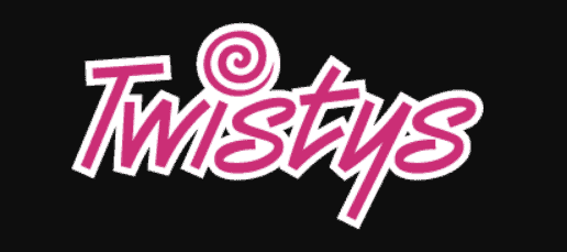
Twistys
5. Twistys pink-colored logo has a dot over the ‘i’ that looks like a lollipop and it perfectly lends to the idea of playful girls inside. Although they used to film mostly hardcore videos, they officially rebranded as a lesbian porn network earlier this year.

Blacked
4. Blacked.com has a deceptively basic logo with a deeper meaning. The text is in white and on a black background, and that white-on-black contrast is perfect for an interracial site. I also have a feeling that the size of the font is no accident – instead of block letters, we could call them BBC letters! In a very short amount of time, helped by signal boosting by such fans as Kanye West, Blacked has become one of the most recognizable and popular porn site logos around.
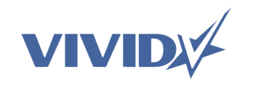
Vivid
3. Vivid‘s logo combines their name in clear, easy to read block letters, with a creative graphic that looks like a star with a ‘V’ cutout in the middle. They have long focused on delivering top adult performers to your screen along with some of the world’s most infamous celebrity sex tapes. Vivid is all about star power!
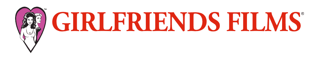
Girlfriends Films
2. Girlfriends Films has a cute logo. The two women inside the heart resemble characters from a comic strip. I must confess that because one is blonde and the other is brunette, they make me think of Betty and Veronica from Archie Comics. I always wondered when those two girls would stop fighting over a boy and just fuck each other!
Dogfart
1. In the number one spot, Dogfart has a suitably OG logo that looks like the tag of an intercity graffiti artist. Unlike other brands, they haven’t radically changed their look over the last 16+ years they’ve been in business. The name, which refers to the sound a pussy makes when fucked by a big black cock, might not be self-explanatory, so the image helps bring it into focus. For this, we have it listed as THE best porn site logo
Have Any Favorite Porn Site Logos?
Looking over my list, you may have remarked that most of these websites are very popular. Which begs the classic question of which came first? Does their popularity come in part from having a well-made logo as part of their plan to reach the masses, or does being a successful brand allow them to spend more money on their design? Maybe a little of both.
Most Popular Porn Sites – Reviewed

If everyone is happy to pay money for something, then you can generally count on it being a quality product – and that is the case with the most popular porn sites…
Read Reviews Now